MyWoof.com
Homepage Revamp
- Role:
- Lead Product Designer
- Duration:
- 1 month
- Contribution:
- Data analysis, research, design
- Platform:
- Web (desktop + mobile)
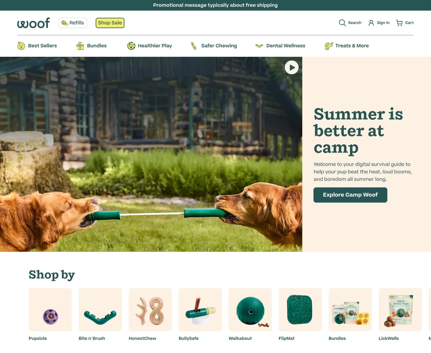
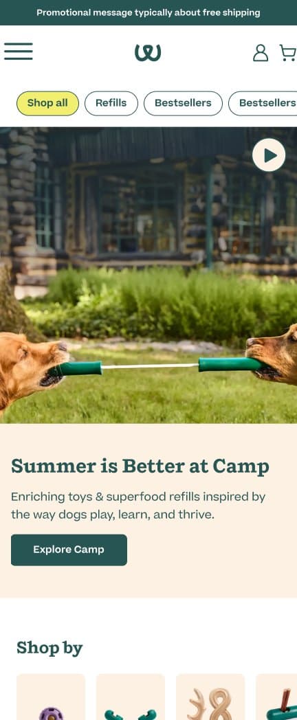
Woof launched a new homepage with a stronger visual design, but in an A/B test against the original it underperformed on the metrics that matter most. Conversion rate went up slightly, but revenue per visitor fell 1.03% (an estimated -$3,076/month), average order value dropped 2.50%, and profit per visitor declined 1.39%. More people were buying, but they were spending less.
As lead product designer, I dug into heatmap and scroll data to understand why, then turned the findings into six proposed changes, each with its own rationale and a hypothesis we can measure. The goal is to educate and orient visitors before asking them to buy, bringing AOV back in line with the original homepage while keeping the conversion gains.
The revised homepage is currently being A/B tested.
Original vs. new homepage
The original homepage and the new homepage that launched in its place. Scroll inside each frame to see the full page.
Original homepage
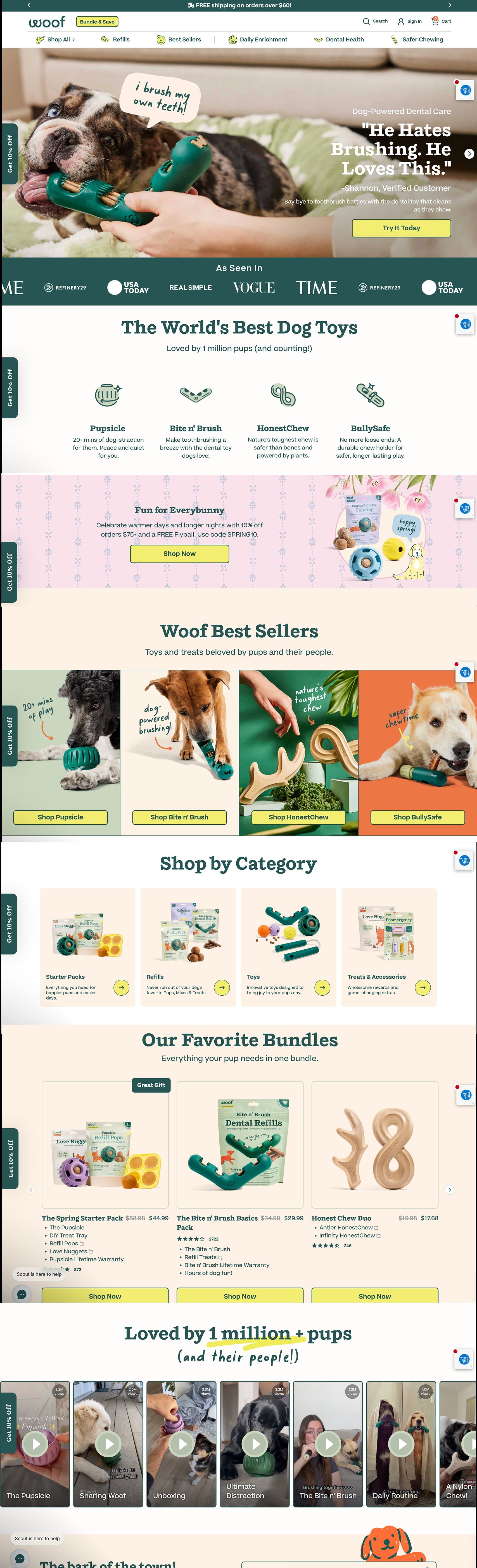
New homepage — desktop
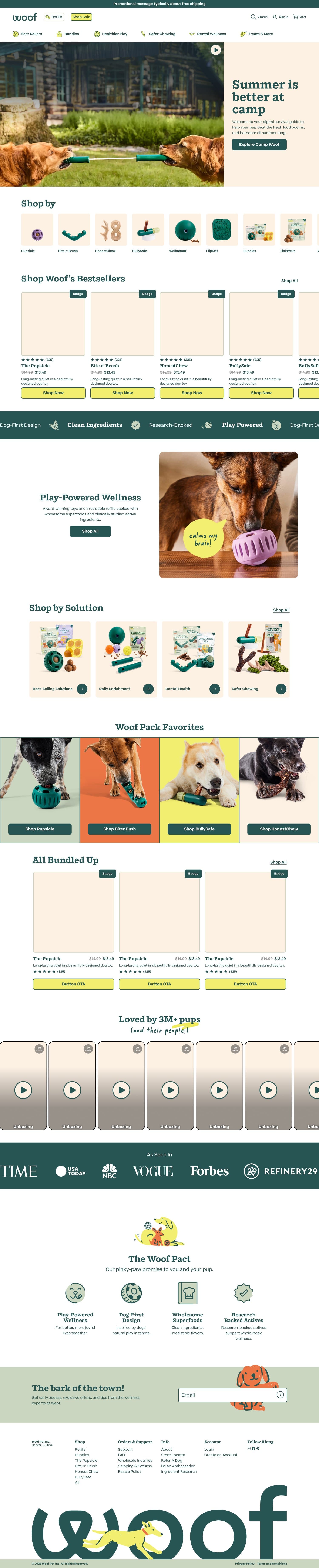
New homepage — mobile

The problem
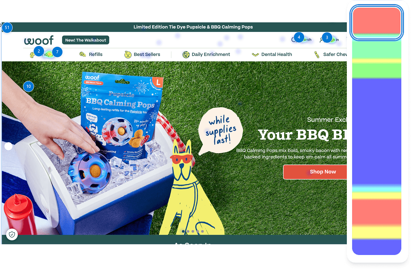
Heatmap and scroll data tell us why. Over 50% of users drop off at the hero on both desktop and mobile. Only 25% of mobile users and 33% of desktop users make it to the product section. The most clicked element on the page is “Shop All”, meaning users are arriving, not finding what they need quickly enough, and escaping to the navigation.
Key takeaway: the homepage is not doing its job of educating, orienting, or converting users before they leave.
Discovery
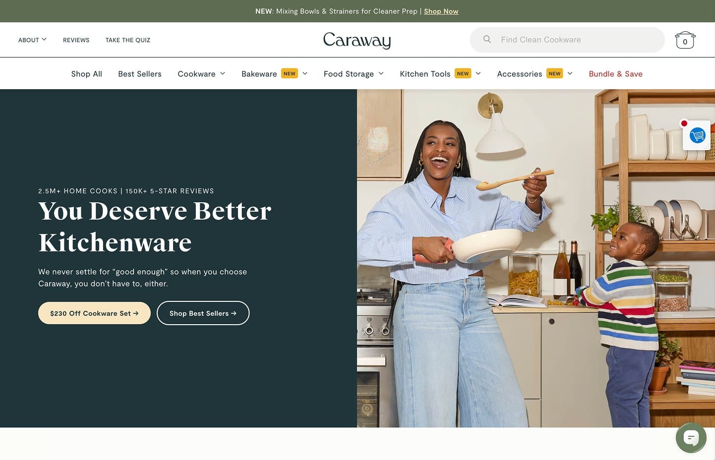
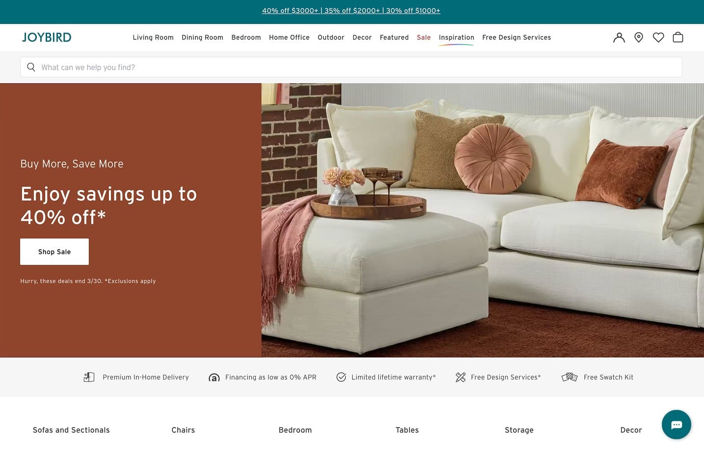
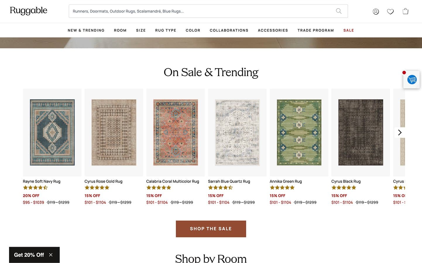
To see how other direct-to-consumer brands help visitors get oriented quickly, I reviewed the homepages of Caraway, Joybird and Ruggable. Each keeps category navigation front and center, pairs the hero with a direct call to action, and surfaces value props or clear shopping paths right below it.
Proposed improvements & hypotheses
Proposal 1
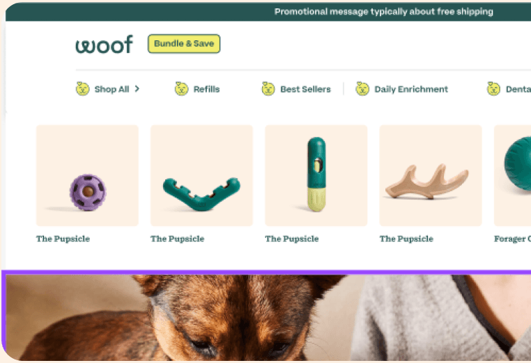
Expose categories above the hero
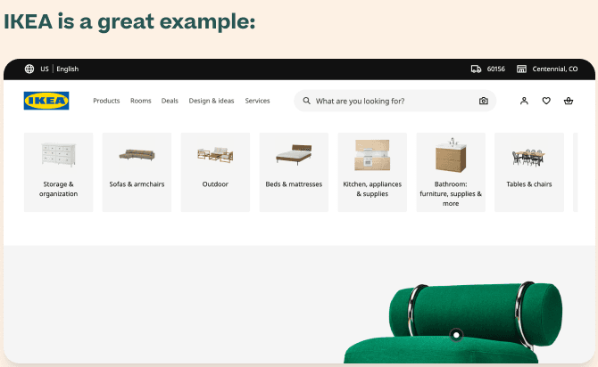
What we're doing: Moving key navigation categories to the very top of the page, above the hero image, so users can orient themselves immediately on landing.
Why we think it will work: The heatmap shows “Shop All” is the most interacted element on the homepage. Users are skipping the page content entirely to find their own path. By surfacing categories before the hero, we meet that behavior instead of fighting it. Users with clear intent can navigate immediately, while browsers still see the hero below. IKEA is a great example.
Hypothesis: exposing categories above the fold will reduce “Shop All” bounce and increase category page traffic from the homepage.
Proposal 2
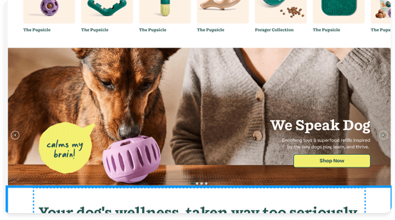
Shorten the hero image
What we're doing: Reducing the hero height slightly so more content is visible above the fold without scrolling.
Why we think it will work: On mobile, the hero is consuming the entire first screen, meaning users see nothing but a campaign image before they decide whether to stay or leave. The hero gives them no product information, no navigation, and no reason to scroll. Reducing its height means users see the education section and category navigation sooner.
Hypothesis: a shorter hero will increase scroll depth past the fold and reduce immediate bounce rate.
Proposal 3
Move brand education above the product grid
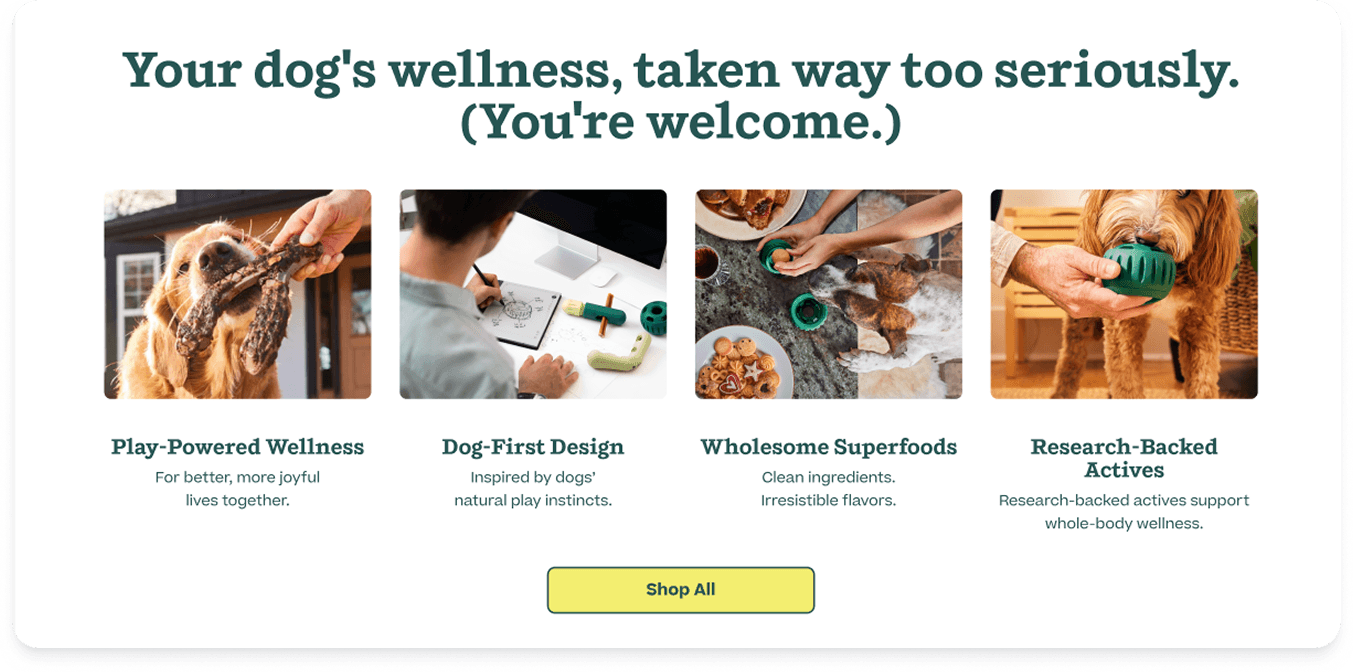
What we're doing: Replacing “the woof pact” with something like a “Your dog’s wellness, taken way too seriously” section, with the four brand pillars and real photography, directly below the hero, before any products are shown.
Why we think it will work: Our own A/B test data showed that the Safer Chewing LP with more educational content outperformed the less educational version by +11.75% CVR, +26.08% revenue per visitor, and +12.82% AOV. HonestChew LP, which leads all pages on both ATC and CVR, has an educational module directly beneath its hero. The pattern is consistent: education before the product ask drives higher quality purchases. First-time visitors don't know what makes Woof different from any other pet brand. Showing them before showing them a price means they're buying with confidence rather than hesitation.
Hypothesis: moving education above the product grid will increase AOV by giving users a value framework before they see prices.
Proposal 4
Add a brand differentiation carousel
What we're doing: Including a scrolling or animated carousel that highlights what makes Woof uniquely different: clean ingredients, research-backed actives, dog-first design, play-powered wellness.
Why we think it will work: The four pillar section does the heavy lifting, but the carousel reinforces those claims in a lightweight, fast-to-scan format as users move through the page. It keeps the brand narrative present without requiring a dedicated section at every scroll depth.
Hypothesis: repeated brand reinforcement through the page will increase purchase confidence and reduce drop-off at the product section.

Proposal 5
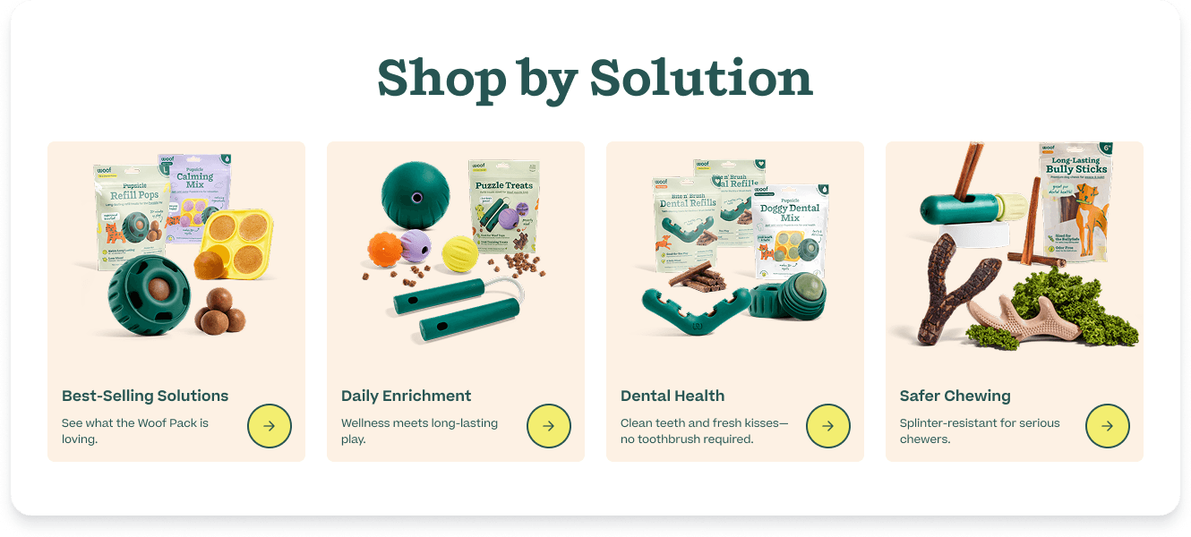
Bring "Shop by Solution" higher on the page
What we're doing: Moving the solution-based navigation (Best-Selling Solutions, Daily Enrichment, Dental Health, Safer Chewing) up the page so it's visible earlier in the scroll journey.
Why we think it will work: Many Woof customers don’t know which specific product they need; they know their dog’s problem. “My dog is an aggressive chewer.” “My dog hates the toothbrush.” Solution-based navigation meets users at their problem rather than asking them to already know the product. Currently this section is buried below the fold where only the most engaged users see it. Moving it up gives every user a clear, low-friction path to the right product.
Hypothesis: earlier solution navigation will increase click-through from homepage to category and product pages, particularly for new visitors.
Proposal 6
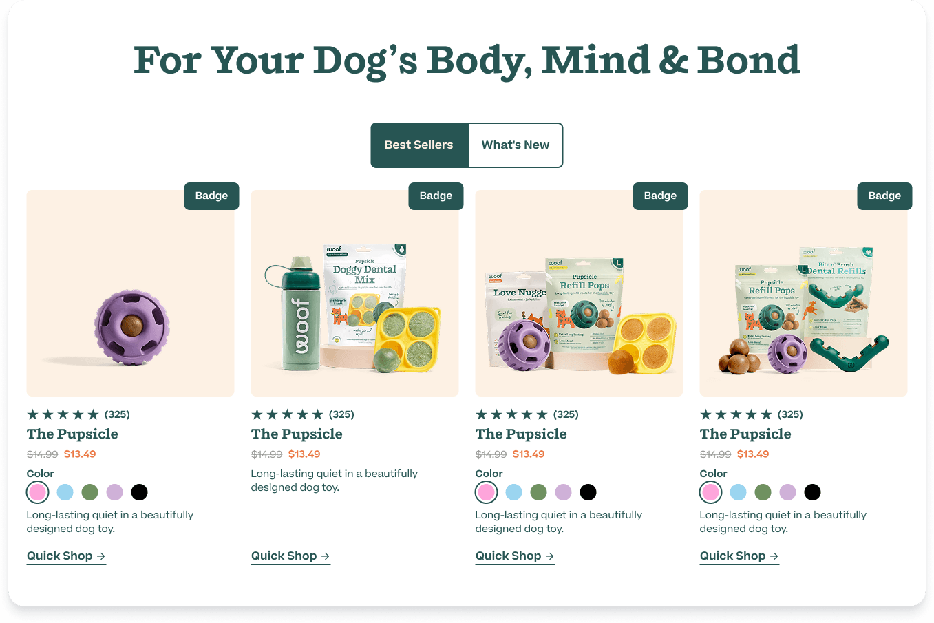
Move best sellers to the bottom
What we're doing: Repositioning the best sellers product grid lower on the page, after the education and solution navigation sections.
Why we think it will work: The current best sellers section appears before users have enough context to make a confident purchase decision. The product cards are also complex (size selectors, flavor dropdowns, color swatches), which creates cognitive load for users who are still in browsing mode. By the time a user has seen the brand education, understood the solution categories, and scrolled to best sellers, they're in a higher-intent state and more likely to engage meaningfully with a product.
Hypothesis: repositioning best sellers below education and solution navigation will increase engagement with product cards and reduce the rate of users defaulting to “Shop All” as their only navigation option.
What we're watching
The primary metric: average order value. CVR going up while AOV goes down tells us we’re attracting buyers but not the right buyers. These changes are specifically designed to educate before selling, which should bring AOV back in line with the original homepage while maintaining or improving the CVR gains the new homepage delivered.
Secondary metrics: scroll depth past the hero, click-through rate on “Shop by Solution” tiles, and direct navigation vs “Shop All” usage.
The A/B test is running now. Results to come.