Tripadvisor
Travel Guides
-
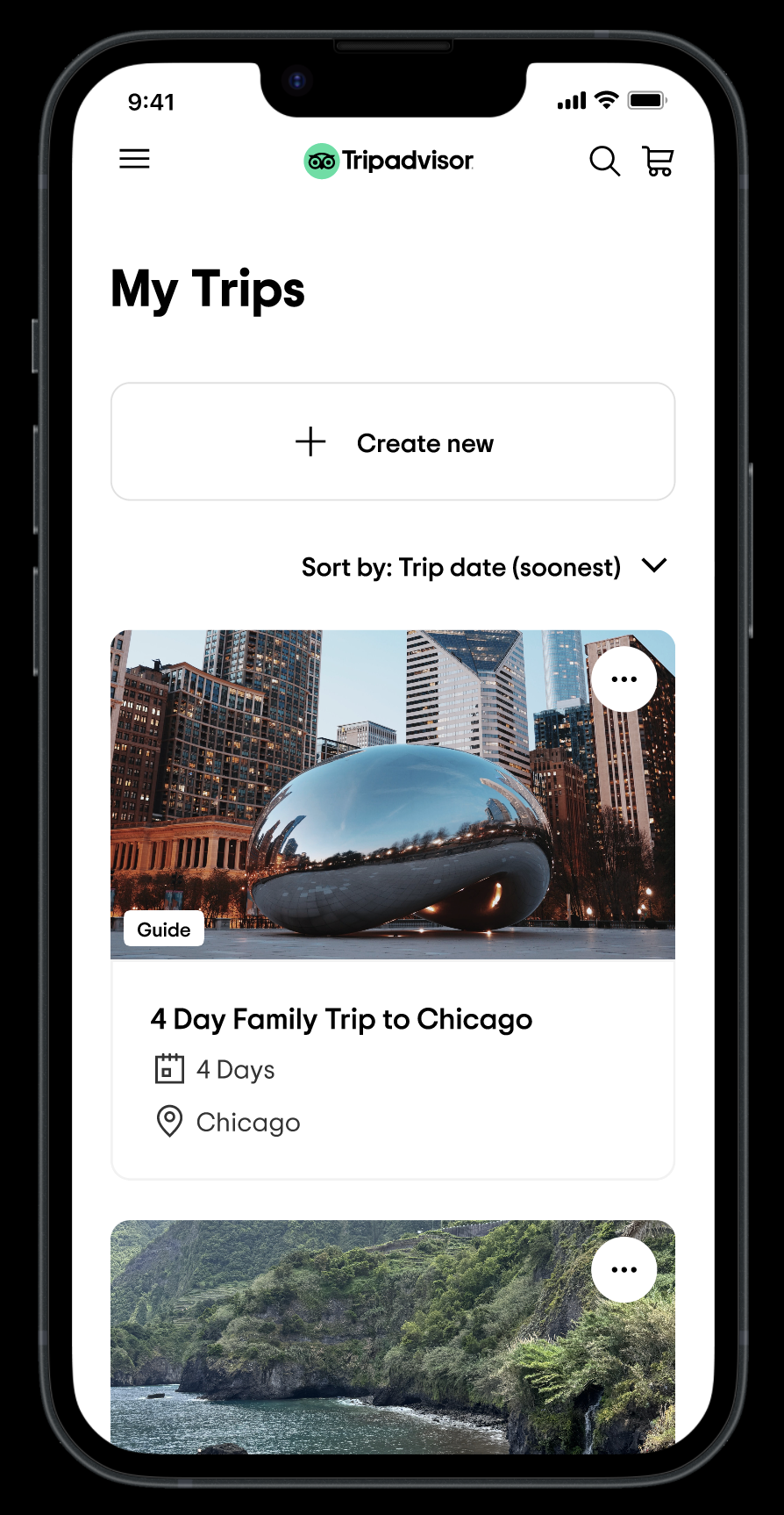
Our team at Tripadvisor recently redesigned the trip planning tool. The product helps our travelers, get new ideas, store all their saves under one trip, and give them the tools to organize it into an itinerary. So help them in all their upcoming trip needs.
As an extension of the trip planning tool, we want to give our users the ability to write about their trip after they’ve been on it. Give our users the space to write about their real life experiences, talk about their favorite places, upload their own photos, and share it with their friends and to the tripadvisor community. -
Discovery phase
For this project, we took 2 weeks in discovery phase. In order to make this tool a success, we knew it would require a lot of thought and careful considerations. We dedicated our time outlining goals, identifying our core users, and mapping out their core loops and user journeys. This was assisted by extensive competitive analysis, inside and outside the travel category.
This was also the time to take a look and analyze competitors. -
Round 1 - Concept testing
For the beginning of this project, our team wanted to focus on the “public view”, the view we wanted users to publish on our website, and work our way backwards. After the discovery phase, 4 concepts (coming soon) were created and put into testing. We wanted to test these 4 concepts to get a pulse from our users about:
1. Reading long lengthy content vs short form2. More text vs heavy imagery
3. List of saves vs editorial writing
And many more
Round 2 - Public view + testing
Out of the first round of testing, we got a lot of great feedback from our users. This feedback narrowed down 1 concept, along with combining a few other aspects into one. The next round of research dug more into the details of the content displayed. This included author, tags, map, content, and article discussion.
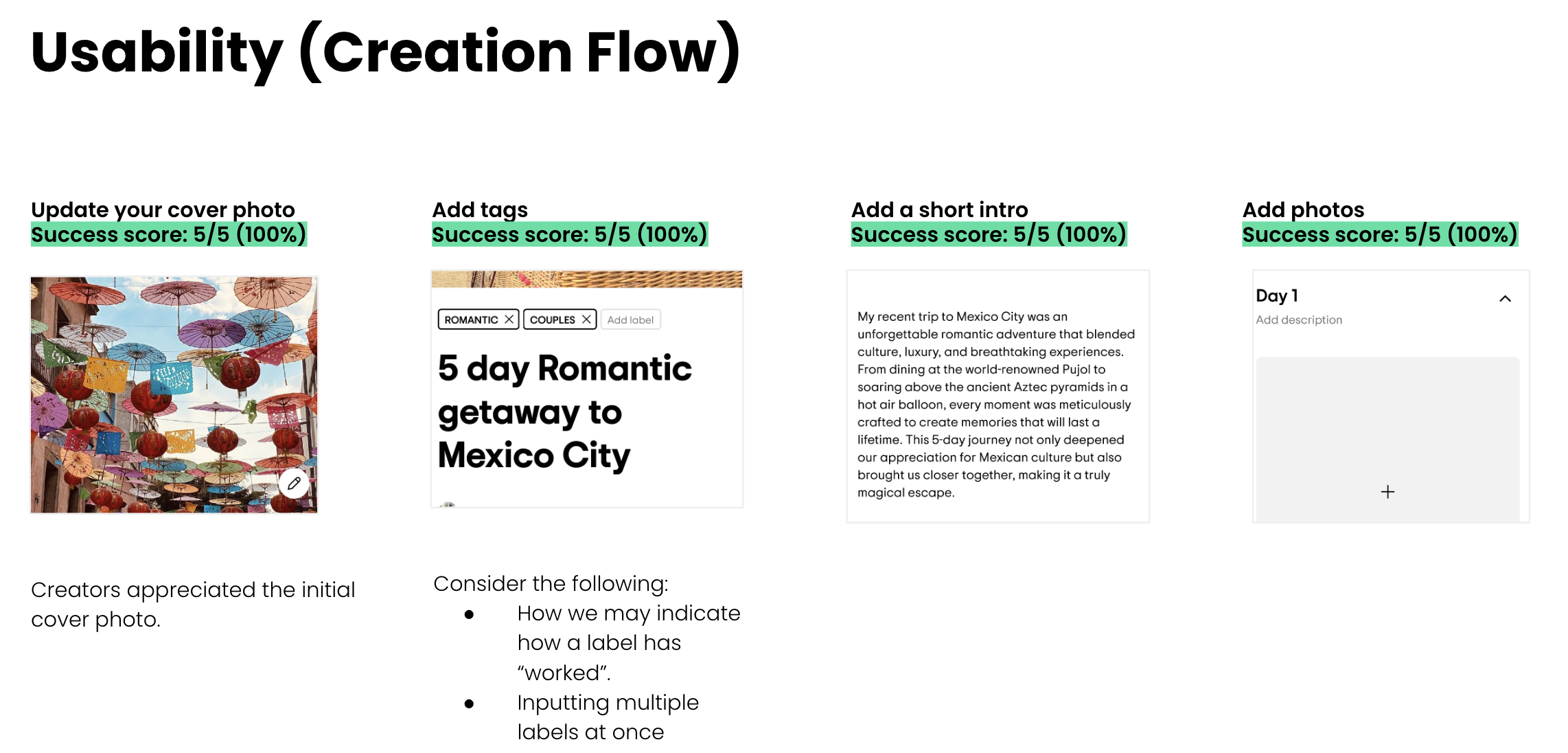
Round 3 - Creation flow + testing
After the second round of testing was conducted, we felt confident enough around what users found most engaging for a travel public article. Working backwards, I identified the sections that were “edit-able” to the creator and sections that were static. I worked on many creation flow concepts, from highly flexible but open ended to very structured but easy to follow. After a few rounds of discussions with the team, we agreed that meeting in the middle was the best approach.
Discovery
Competitor Research
I gathered examples and marked up what’s working and what’s not working

User journey
I mapped out several users journey of their process from point A to point B
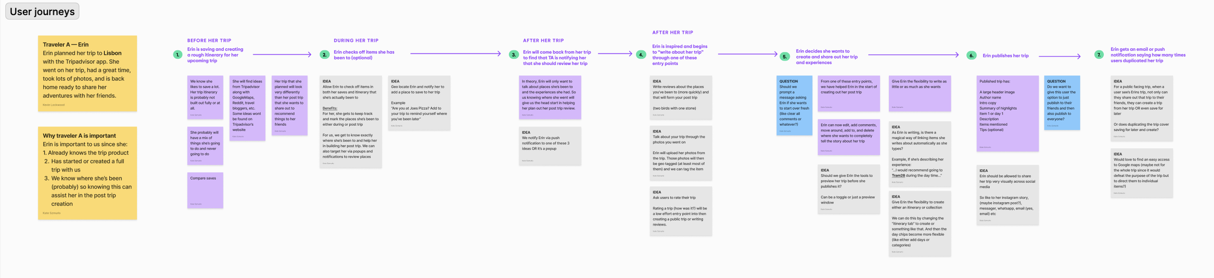
Identify user problems
After mapping out the user journey, I identified key pain points and transform them into a narrative. I then categorized these insights by theme and begin exploring concepts through sketches or quick wireframes.
As you can see, this process is highly collaborative!!


Wireframing
After collaborating with my team and solidifying concepts, I begin to put sketches into wires. I also take the time to organize the wires into a flow of the experience.

Testing
User Research
UXR Round 1 Goals:
Gauge if passionate travelers use itineraries to plan things to do
Gather feedback on the current UI and each new design concept
Determine which design motivates passionate travelers the most to engage (i.e. save items; create itineraries)
Identify anything that is unclear, missing or a pain point

Key insights
Half of passionate travelers already use itineraries.
Editorial view is the most preferred format.
List format lacks personality and any itinerary structure.
Passionate travelers are mixed when it comes to likelihood of creating any of these itineraries.

UXR Round 2 Goals:
Within this round of testing we sought out the feedback of Content Creators who have worked with Tripadvisor.


Key Findings
Our guide creation process is simple and intuitive.
Content creators score the creation process a 4.2 /5.0. The process is seamless and our thoughtful guard-rails ensure that creators will make impactful guides that travelers will appreciate.
The published view is highly rated (4.6 / 5.0)
The page is clean and aesthetically pleasing while also being full of helpful content. Users also appreciate the mix of content forms (more detailed + more tactical).
Creators are undecided (3.8 / 5.0 ) when it comes to their likelihood to create a guide. Causes for their hesitation include:
Compensation: How lucrative can this guide be for them?
Uploading: Will we create an easy way for them to transfer content from their current blogs to our guide?
Branding: Can they brand this guide with their logo so it feels like its coming from their company - not just Tripadvisor?